
Client:
Idam Emmanuel
Year:
@2025
Category:
Graphic design / Branding
Location:
Kazan, Russia


The Challenge
The brand “Afrostop” began as just a name—an idea waiting to take form. Our task was to transform this name into a bold, memorable identity that would resonate across the streets of Kazan, Russia. The client envisioned a brand that would go beyond visual appeal; it needed to be a powerful statement of African heritage, culture, and cuisine. Our challenge was to encapsulate this rich narrative into a design that not only stands out but also proudly represents the essence of Africa in a new cultural landscape.
Our Approach
We began with immersive research into the heart of Africa—exploring its diverse cultures, vibrant identities, traditional patterns, and culinary richness. This phase was crucial to ensure that every design decision was rooted in authenticity and meaning.
From there, we curated visual elements that spoke to the continent’s essence: bold geometric patterns, tribal motifs, earthy tones, and organic textures. Each element was carefully selected not just for aesthetics, but for the story it tells. We then merged these elements with symbolic representations of African cuisine—bringing in shapes and forms inspired by staple foods, traditional utensils, and communal dining practices.
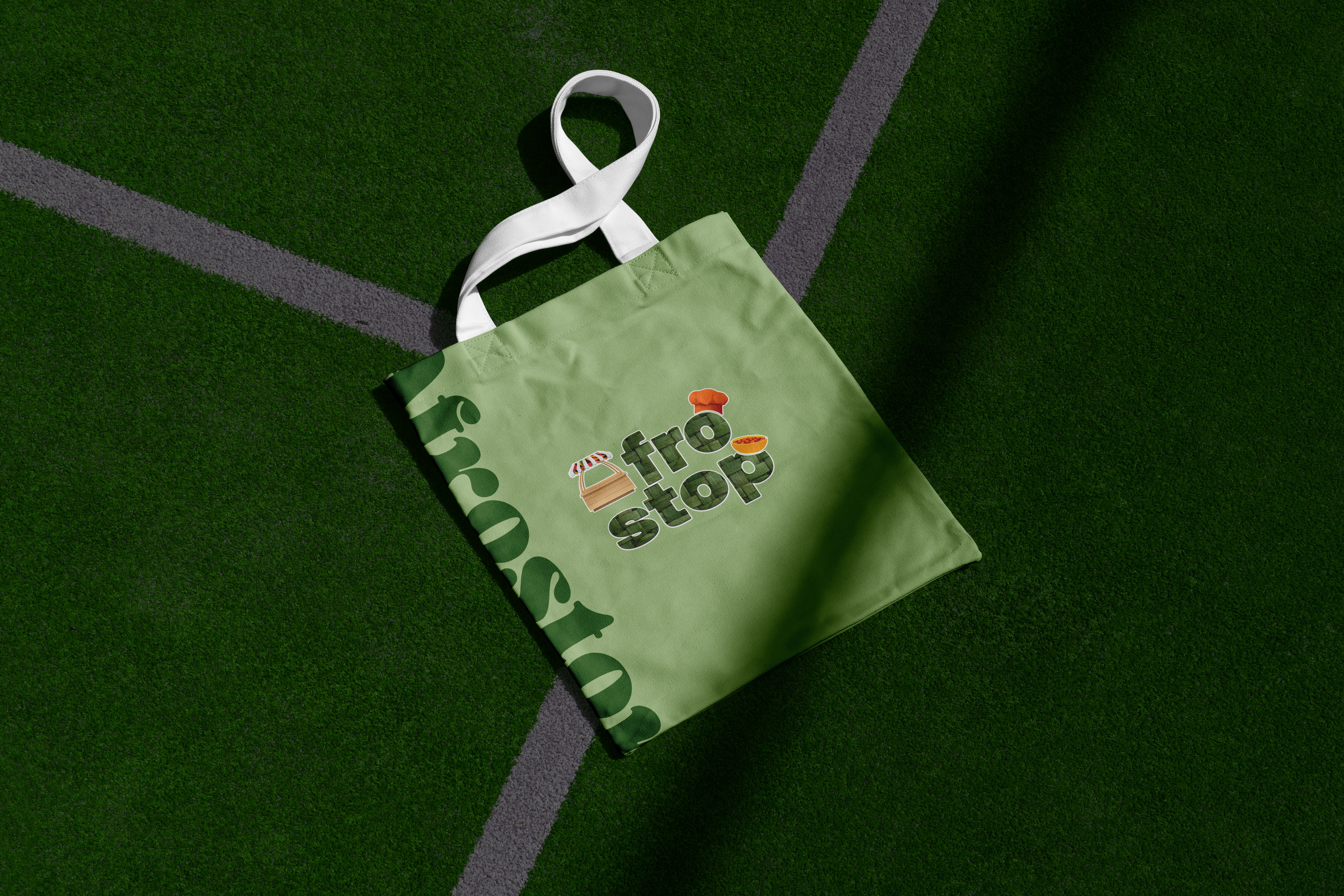
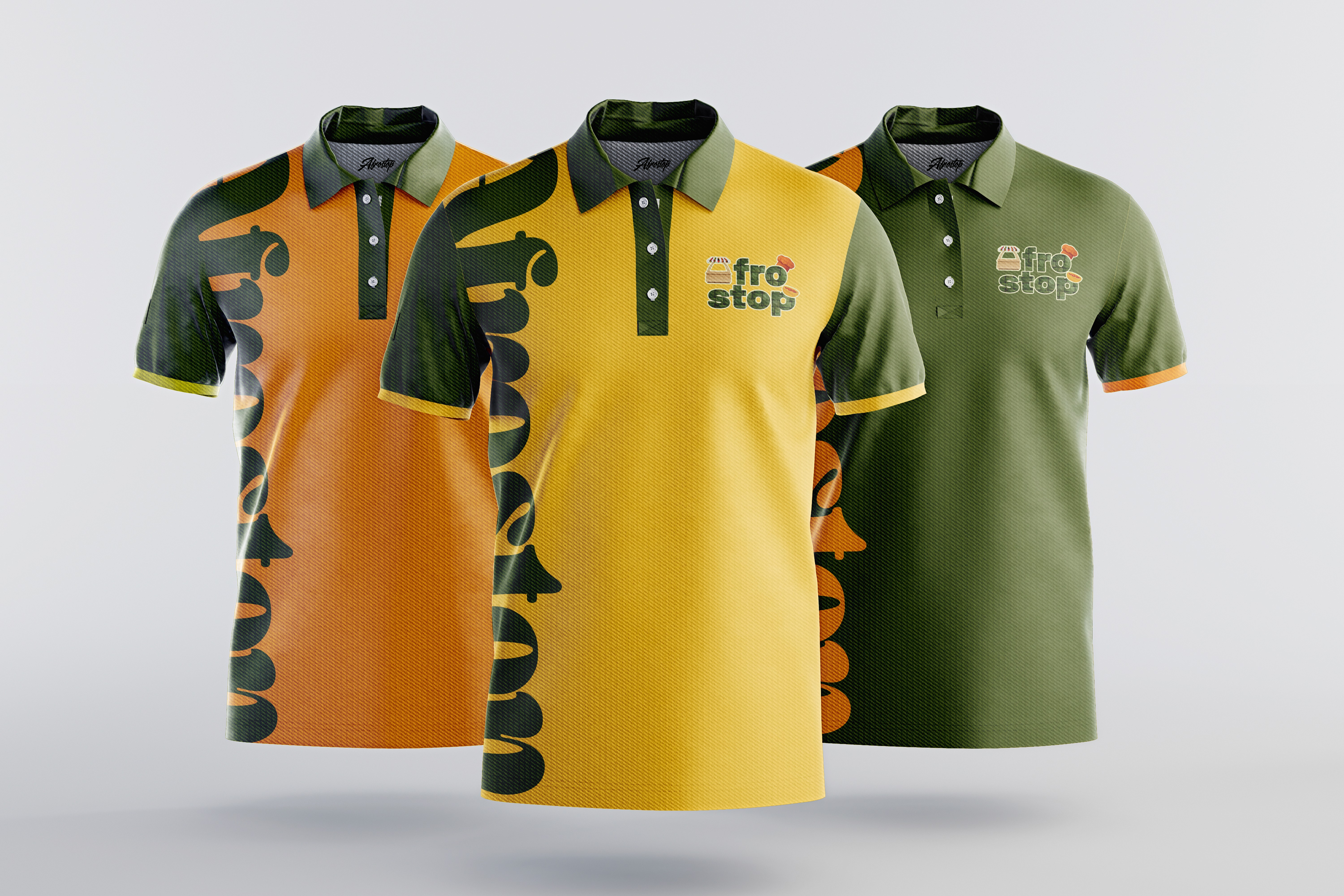
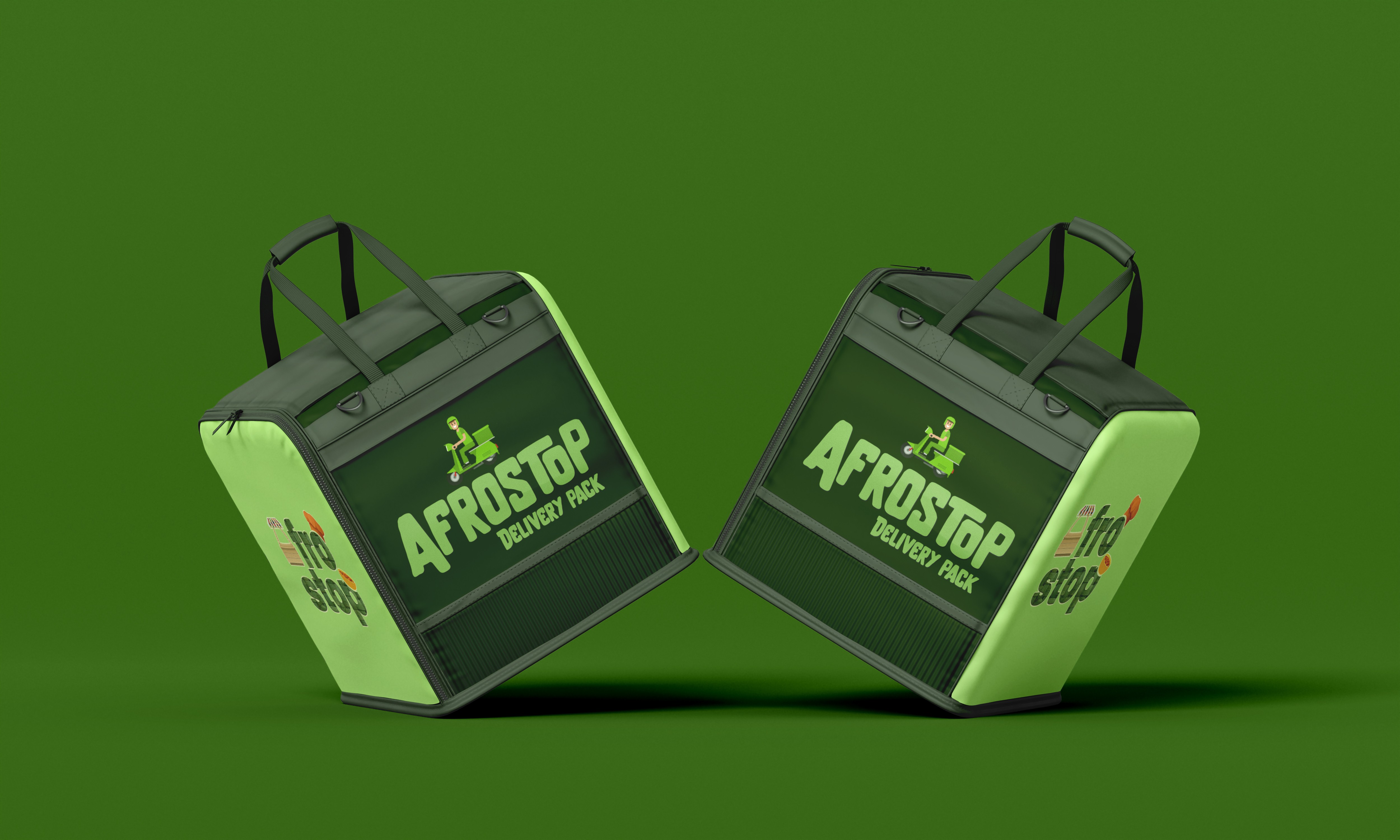
The result was a logo that isn’t just a visual mark, but a cultural beacon. It captures the spirit of Africa and reflects it in a way that is both modern and respectful of its origins. The design balances familiarity for those who know Africa and intrigue for those encountering it for the first time—setting the tone for Afrostop’s identity as a cultural and culinary hub in the heart of Kazan, Russia.The Result
🎨 Cohesive brand identity, increasing recognition and credibility.
📊 50% higher engagement rates across Social Media platforms.
🚀 Increased lead conversions, driving more business inquiries.
📈 Stronger online presence, leading to greater client acquisition and retention.